Easy and Accessible Travels to Ontario
I led the Travel Resources page redesign to improve usability and ensure AODA and WCAG 2.0 compliance, increasing monthly traffic by 40%
Role
UX/UI Designer
Industry
Travel
Duration
4 months
My Responsibilities
Led end-to-end UX process from research to prototyping and user testing. Conducted a UX audit, developed wireframes and prototypes to solve information architecture issues, and created accessible designs meeting WCAG 2.0 AA standards.
The Challenge
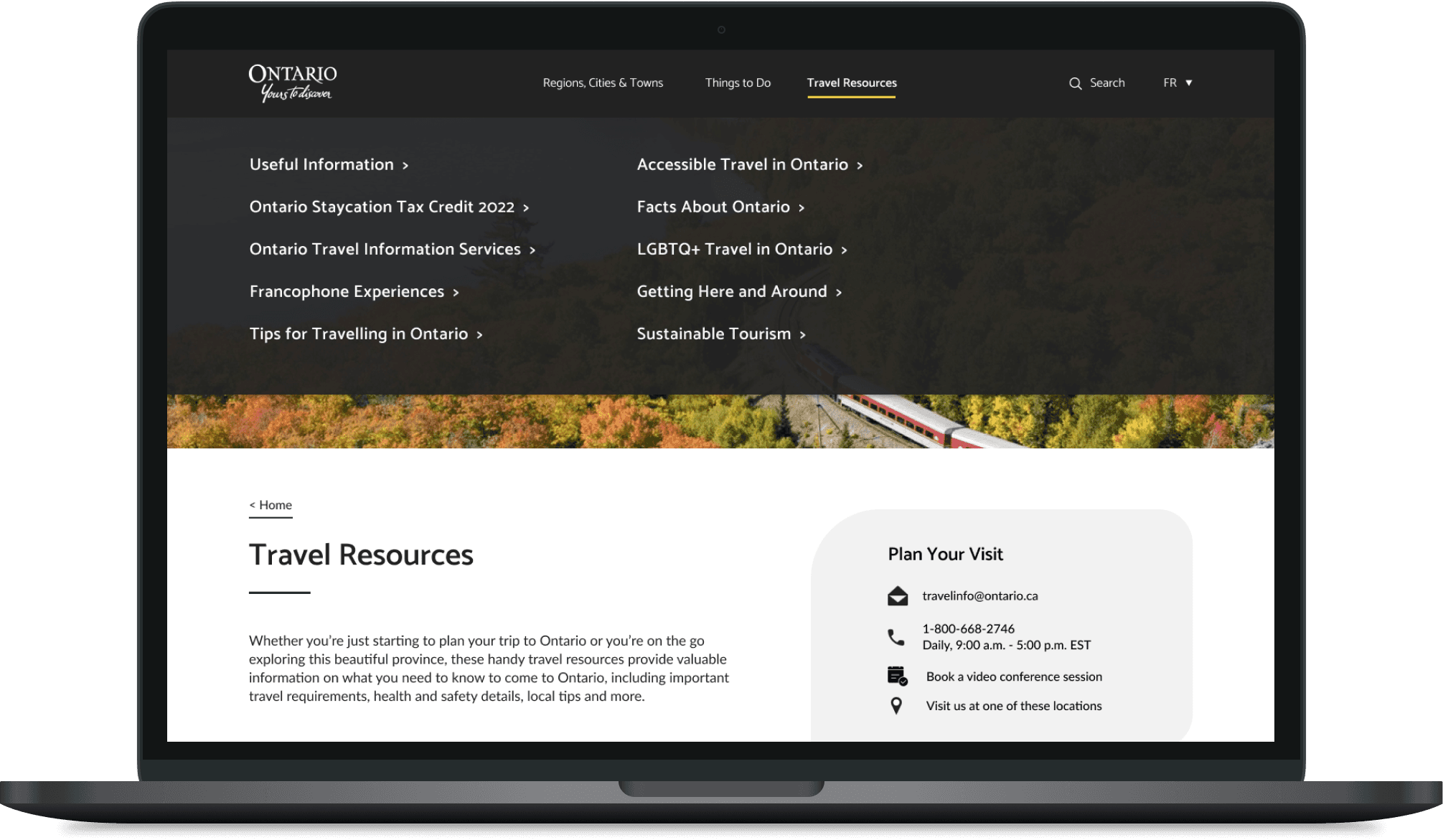
Destination Ontario is a government agency dedicated to promoting tourism in the province. One of its most critical pages, Travel Resources, was designed to be the central hub for international and domestic visitors seeking essential information, including visas, transportation, and accessibility.
But the page was falling short. Key issues included:
High bounce rate: 75% (industry average ~45%)
Low user engagement: Average time on page under 30 seconds
Poor accessibility: Failed 12 WCAG 2.0 AA requirements, excluding many of Ontario's 2.6 million residents with disabilities
Overwhelming content: Users struggled to locate relevant information quickly, resulting in frustration and drop-off

Before
High-level Goals
Design for inclusivity and meet AODA + WCAG 2.0 AA compliance
Improve content structure and reduce cognitive load
Enable personalized travel itineraries and the use of maps
Reduce bounce rate and help users quickly find what they need
Research & Insights
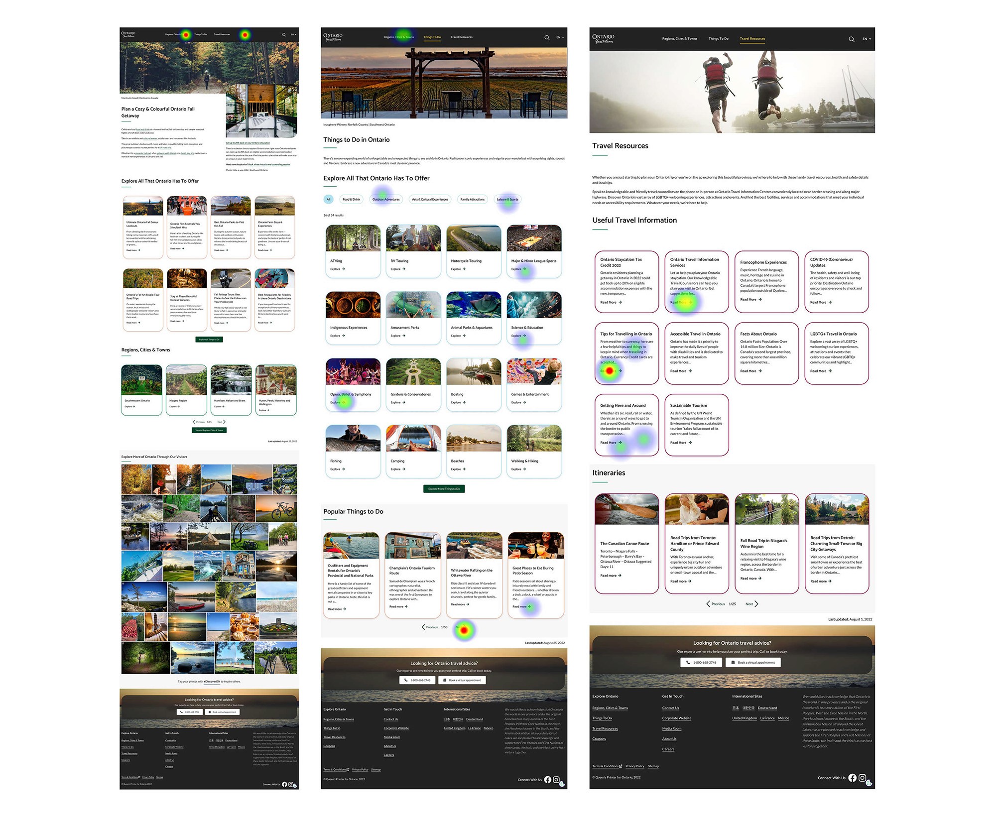
We conducted heuristic evaluations, reviewed analytics, and conducted user testing with users from outside Ontario who had previously visited Ontario. I also performed a competitive audit of similar tourism websites across Canada and globally.

Opportunities
Based on the research, we identified opportunities to:
Prioritize practical resources like maps, accessibility info, and trip planning tools
Support trip planning workflows and seasonal needs
Present content in a visual and mobile-friendly way
Highlight unique Ontario experiences (local food, parks, culture)
The Solution
Simplified Content Architecture | Visual Cards & Map Integration | Personalization Features | Accessibility Enhancements |
|---|---|---|---|
Moved "Regions, Cities, and Towns" to "Places to Go" | Used Google Maps API for embedded route planning | Concepted a “Build Your Itinerary” tool with filters by interests (food, festivals, nature) | Improved screen reader tagging and keyboard flow |
Restructured Travel Resources into scannable sections and cards | Introduced visual cards for visa info, transport, and travel tips | Allowed users to save places and events to custom travel plans | Adjusted all components for WCAG 2.0 compliance |
Created a new Blog section for storytelling and itinerary inspiration | Improved mobile usability with collapsible menus and quick links | Shared accessibility documentation with the dev team and partners |

Impact
Key Metrics Improvement:
🔻 Bounce rate: 75% → 35%
✅ Task completion: 35% → 89%
📱 Mobile traffic: +40% monthly
👍 User satisfaction: 2.1/5 → 4.3/5
Technical Achievements:
Full responsive UI across screen sizes
Design system update with reusable components
Accessibility-first documentation and WCAG 2.0 testing protocols
My Responsibilities
Led end-to-end UX process from research to prototyping and user testing. Conducted a UX audit, developed wireframes and prototypes to solve information architecture issues, and created accessible designs meeting WCAG 2.0 AA standards.
The Challenge
Destination Ontario is a government agency dedicated to promoting tourism in the province. One of its most critical pages, Travel Resources, was designed to be the central hub for international and domestic visitors seeking essential information, including visas, transportation, and accessibility.
But the page was falling short. Key issues included:
High bounce rate: 75% (industry average ~45%)
Low user engagement: Average time on page under 30 seconds
Poor accessibility: Failed 12 WCAG 2.0 AA requirements, excluding many of Ontario's 2.6 million residents with disabilities
Overwhelming content: Users struggled to locate relevant information quickly, resulting in frustration and drop-off
Before
High-level Goals
Design for inclusivity and meet AODA + WCAG 2.0 AA compliance
Improve content structure and reduce cognitive load
Enable personalized travel itineraries and the use of maps
Reduce bounce rate and help users quickly find what they need
Research & Insights
We conducted heuristic evaluations, reviewed analytics, and conducted user testing with users from outside Ontario who had previously visited Ontario. I also performed a competitive audit of similar tourism websites across Canada and globally.
Opportunities
Based on the research, we identified opportunities to:
Prioritize practical resources like maps, accessibility info, and trip planning tools
Support trip planning workflows and seasonal needs
Present content in a visual and mobile-friendly way
Highlight unique Ontario experiences (local food, parks, culture)
The Solution
Simplified Content Architecture | Visual Cards & Map Integration | Personalization Features | Accessibility Enhancements |
|---|---|---|---|
Moved "Regions, Cities, and Towns" to "Places to Go" | Used Google Maps API for embedded route planning | Concepted a “Build Your Itinerary” tool with filters by interests (food, festivals, nature) | Improved screen reader tagging and keyboard flow |
Restructured Travel Resources into scannable sections and cards | Introduced visual cards for visa info, transport, and travel tips | Allowed users to save places and events to custom travel plans | Adjusted all components for WCAG 2.0 compliance |
Created a new Blog section for storytelling and itinerary inspiration | Improved mobile usability with collapsible menus and quick links | Shared accessibility documentation with the dev team and partners |
Impact
Key Metrics Improvement:
🔻 Bounce rate: 75% → 35%
✅ Task completion: 35% → 89%
📱 Mobile traffic: +40% monthly
👍 User satisfaction: 2.1/5 → 4.3/5
Technical Achievements:
Full responsive UI across screen sizes
Design system update with reusable components
Accessibility-first documentation and WCAG 2.0 testing protocols
Reviews
Reviews
"Layla played a crucial role in transforming the UX for MLSE's employee benefits calculation project. From prototyping to productionization, she gathered stakeholder requirements, iterated designs collaboratively, and ensured technical feasibility through meticulous wireframing and engineering alignment. Despite limited meeting time, Layla's proactive approach led to the project's successful company-wide launch, earning exceptional user feedback."
"Layla played a crucial role in transforming the UX for MLSE's employee benefits calculation project. From prototyping to productionization, she gathered stakeholder requirements, iterated designs collaboratively, and ensured technical feasibility through meticulous wireframing and engineering alignment. Despite limited meeting time, Layla's proactive approach led to the project's successful company-wide launch, earning exceptional user feedback."

Andy
Senior Engineer Manager
Other projects

0-1: Building An Automated Ticket Tracking System

Transforming Learning through NBA Activities

Letter Recognition
Easy and Accessible Travels to Ontario
Layla Tait

@ 2025 by Layla Tait
Layla Tait
@ 2025 by Layla Tait
Layla Tait
@ 2025 by Layla Tait