Transforming learning through NBA activities
Scaled and optimized basketball-themed learning content reaching 800k+ learners across Canada and 42 U.S. states
Role
UX Designer
Industry
Education & Sports
Duration
3 months
My role & Strategic impact
I joined the TVO Learn NBA partnership mid-project to design new pages for key moments (winter break announcement, final launch page) and lead a data-driven optimization initiative that would scale and improve the initial experience.
While another designer had created the foundational NBA activities, I was responsible for:
Expanding the experience with new page designs for critical touchpoints
Measuring actual user engagement through a comprehensive 264-response survey across learners, educators, and parents
Identifying and fixing friction points through heatmap analysis and usability research
Optimizing the experience based on real user data, resulting in a 96% reduction in navigation errors
Key outcomes:
800k+ learners reach across North America
85% of educators reported increased learner participation
75% of students found activities engaging
96% reduction in misclick rate (from 10.76% to 0.46%) through targeted improvements
This project demonstrated how strategic research and optimization can dramatically improve an existing experience and provide insights that shaped future TVO Learn partnerships.
The challenge
TVO Learn is an educational platform offering free K-12 resources aligned with Ontario's curriculum. The NBA partnership represented a significant investment in creating learn-first content, a departure from TVO Learn's traditional teacher-focused approach.
When I joined, the initial NBA activities had launched, but the team lacked data on:
Whether learners were actually engaging voluntarily (not just through teacher assignments)
What aspects of the experience were working vs. causing friction
How to communicate new content releases to maximize reach
Whether the learner-first approach was achieving its goals
My challenge: Design new pages for upcoming releases while establishing a research framework to measure success and identify optimization opportunities, all within a 3-month timeline.
High-level goals
Design compelling pages for the winter break and final launch that would drive learner engagement
Measure actual user engagement and satisfaction across key audience segments
Identify friction points and optimization opportunities in the existing experience
Provide data-driven insights to inform future TVO Learn partnership content
My approach & Solution
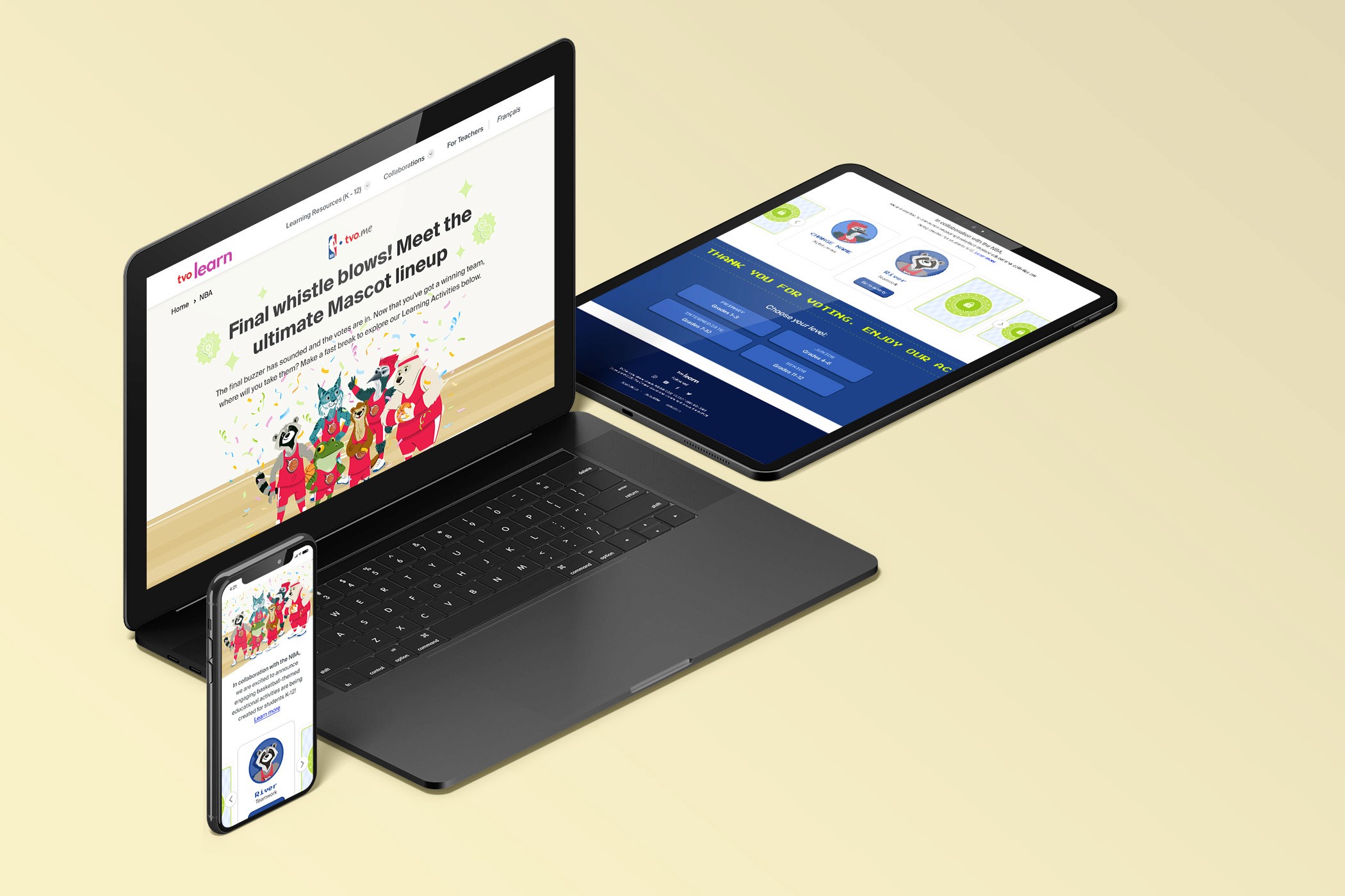
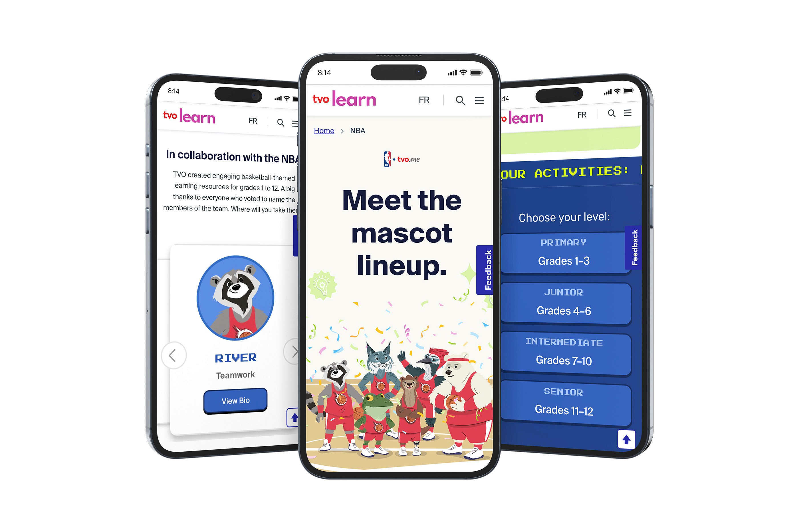
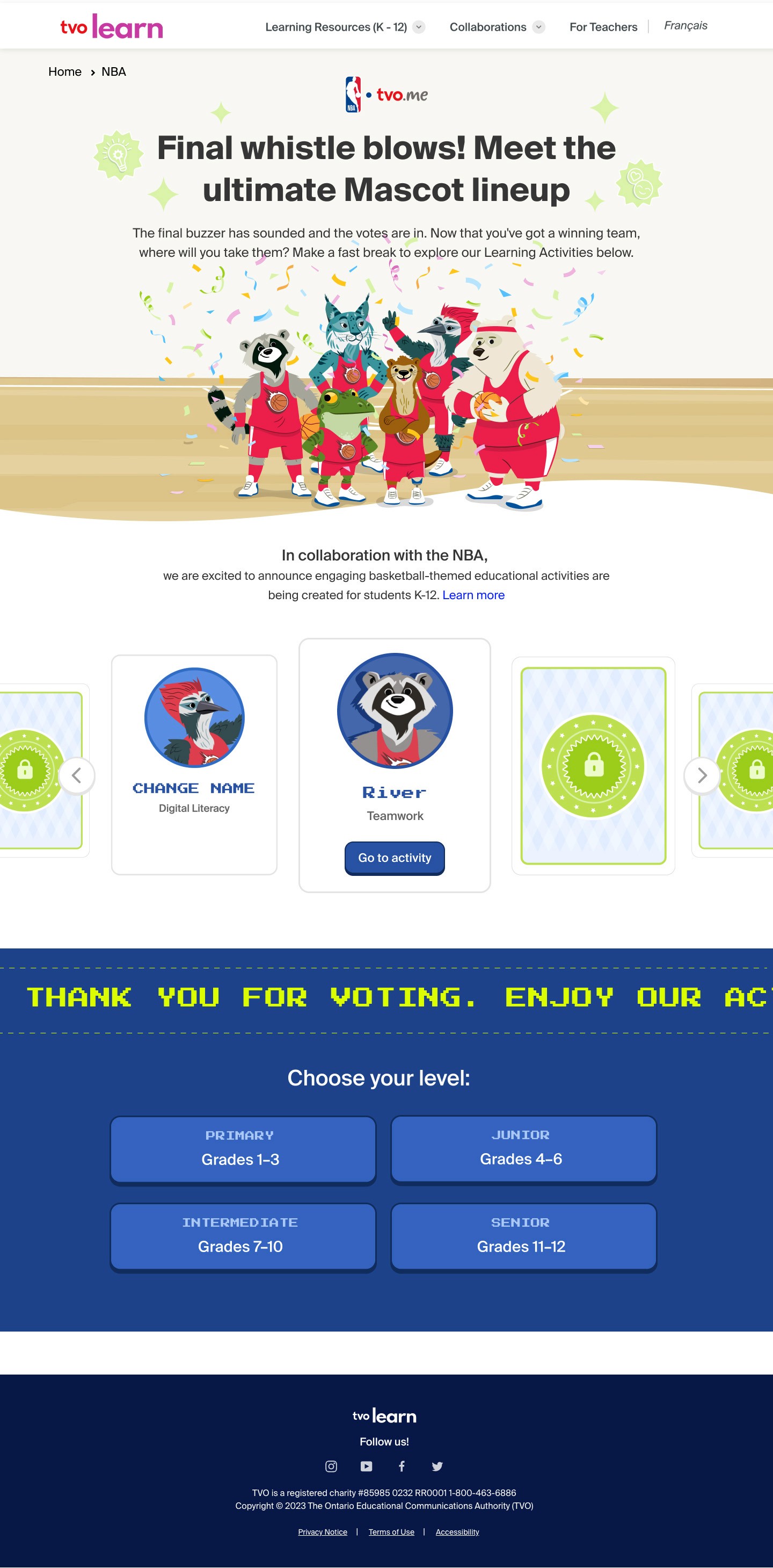
Designing high-impact pages
I designed new pages for critical moments in the NBA partnership: the winter break announcement and final launch page. These pages needed to drive voluntary learner engagement during high-traffic periods while balancing TVO Learn and NBA brands requirements with educational credibility.
Key design decisions:
Created dynamic, learner-first layouts that led with basketball excitement before educational details
Designed context-specific experiences (winter break emphasized fun exploration; launch page balanced learner and teacher needs)
Integrated TVO Learn and NBA branding functionally through navigation and visual hierarchy rather than decorative overlays
Outcome: These pages became the highest-traffic entry points to NBA content.


Establishing a Research Framework
Recognizing that TVO Learn lacked data on whether the NBA partnership was achieving its goals, I advocated for and led a comprehensive research initiative, the first systematic measurement of learn engagement for partnership content.
Research approach:
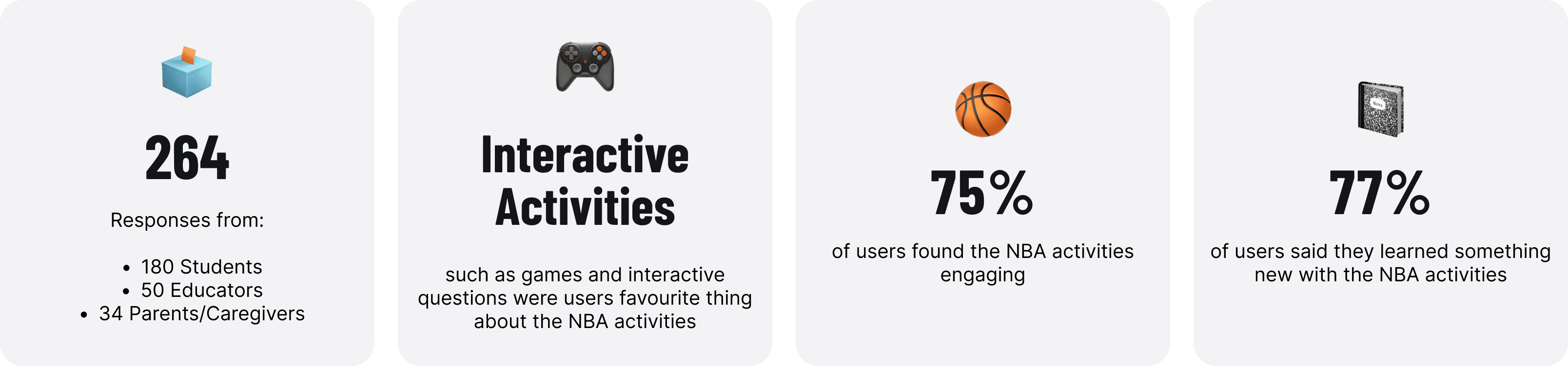
264 user surveys across learners (180), educators (50), and parents (34) to understand motivation, barriers, and context of use
Heatmap analysis to identify navigation friction and actual user behaviour patterns
Key insights uncovered:
55% of access came from home: learners were choosing to use the content voluntarily
75% of learners found activities engaging; 77% learned something new
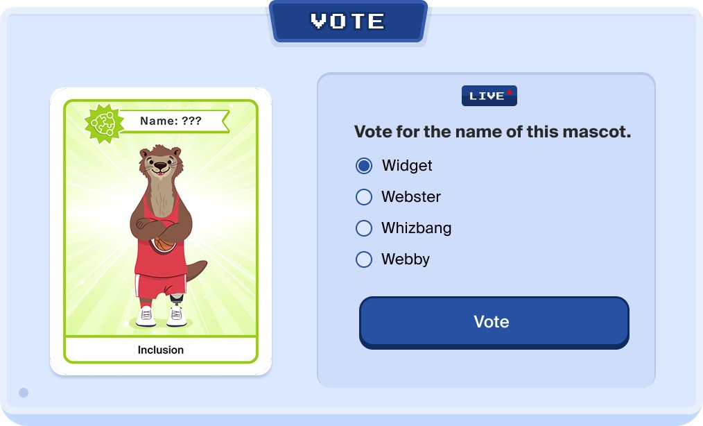
Interactive content was the differentiator: games and interactive questions drove the highest engagement
Critical usability issue: 10.76% of clicks were on non-interactive elements learners mistook for buttons
Data-Driven Optimization
Based on the heatmap analysis revealing navigation confusion, I designed and implemented systematic improvements to visual affordances and interaction patterns.
Solutions implemented:
Created clear visual distinctions between interactive and static elements, using TVO Learn colours strategically
Applied consistent interaction states (hover, active, disabled) across all touchpoints
Worked with engineering to add micro-interactions that reinforced clickability
Restructured content hierarchy based on where users were actually clicking
Outcome: Reduced misclick rate from 10.76% to 0.46%, a 96% reduction that eliminated the primary friction point in first-use experience.
Cross-functional influence
I navigated complex stakeholder dynamics (TVO Learn team, NBA partnership, engineering) by building a business case for post-launch research, using data to drive alignment rather than opinions, and translating insights into prioritized, actionable improvements. This approach secured resources for research and established data-driven decision-making as standard practice for future partnerships.
Impact & Outcomes
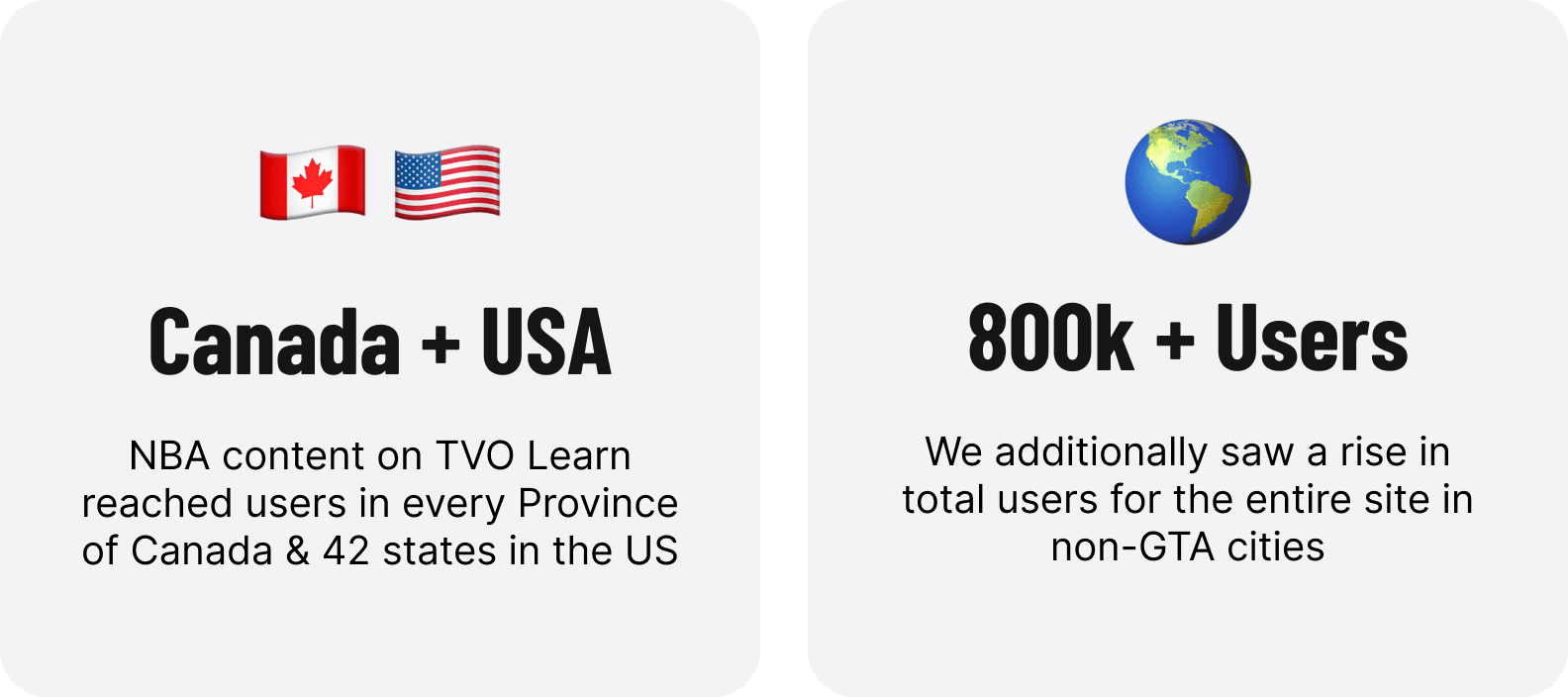
800k+ learners reached across Canada and 42 U.S. states
85% of educators reported increased learner participation
96% reduction in misclick rate (10.76% to 0.46%) through UX improvements
75% of learners found activities engaging; 77% learned something new
55% accessed from home, indicating strong voluntary use
Key user motivations identified: Subject-specific learning, interest in basketball/NBA, need for supplementary teaching tools, enjoyment of interactive elements
Broader impact: The research framework I established became standard practice at TVO Learn for evaluating partnership content. The page design templates I created became reusable patterns for future content releases.
Reflection & Key Takeaways
What worked: Leading with research transformed stakeholder conversations from opinion-based to evidence-based. The 264-response survey and heatmap analysis became the foundation for decision-making and informed future partnership strategies.
What I'd improve: I'd involve learners as ongoing design advisors earlier and push for A/B testing capabilities to reveal even more optimization opportunities beyond the initial research.
The lesson: Joining a project mid-stream doesn't limit your impact. By identifying what was missing (data), advocating for research, and translating insights into improvements, I enhanced the experience for 800k+ learners while establishing frameworks that shaped TVO Learn's approach to future partnerships.

